CASE STUDY
John Steinbeck
Penguin Classics

Process
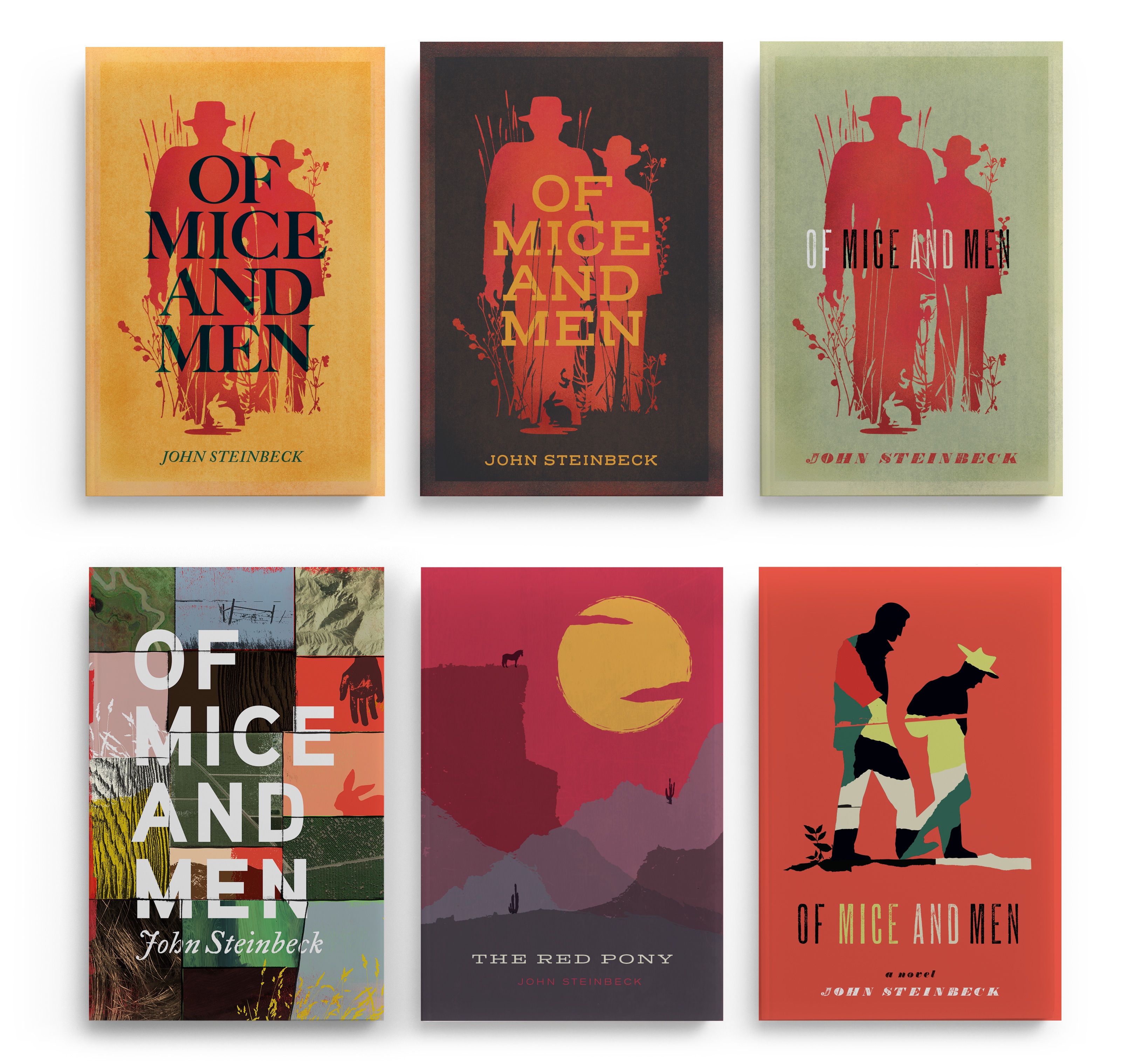
These stories are deeply human tales about choices. The themes of westward expansion and manifest destiny loom large, as does the landscape and conditions the characters find themselves in. For us, the approach was to explore these character interactions while expressing a sense of place. The landscape must be considered as its own character. We explored many styles to accomplish this as represented here in the various options we presented.
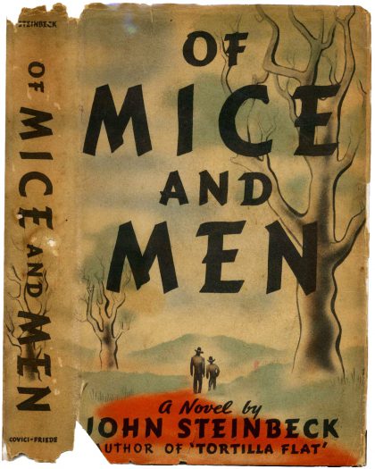
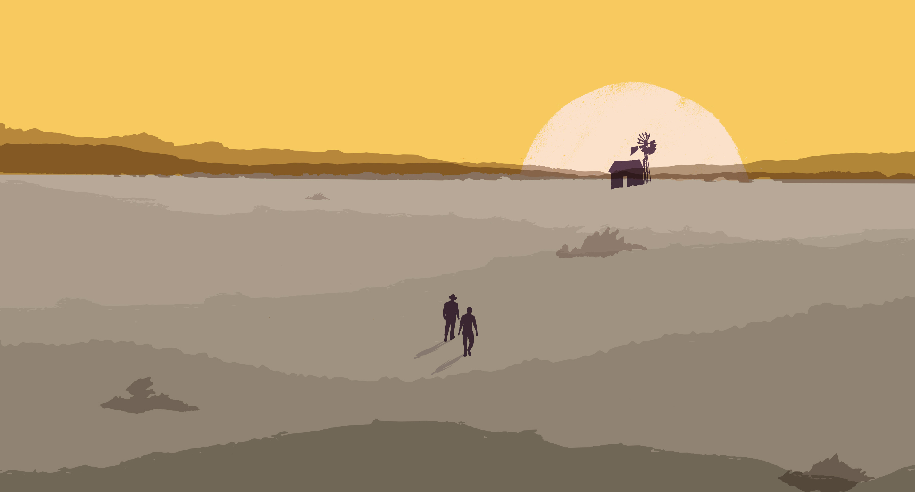
The first edition Of Mice and Men is an iconic piece of graphic design that is tough to improve upon. Reinterpreting the simplicity of its imagery, mood, and style is a worthy albeit intimidating brief. We decided to keep the silhouette approach of the original but to amplify the drama by dwarfing the characters with a harsh and overwhelming landscape.
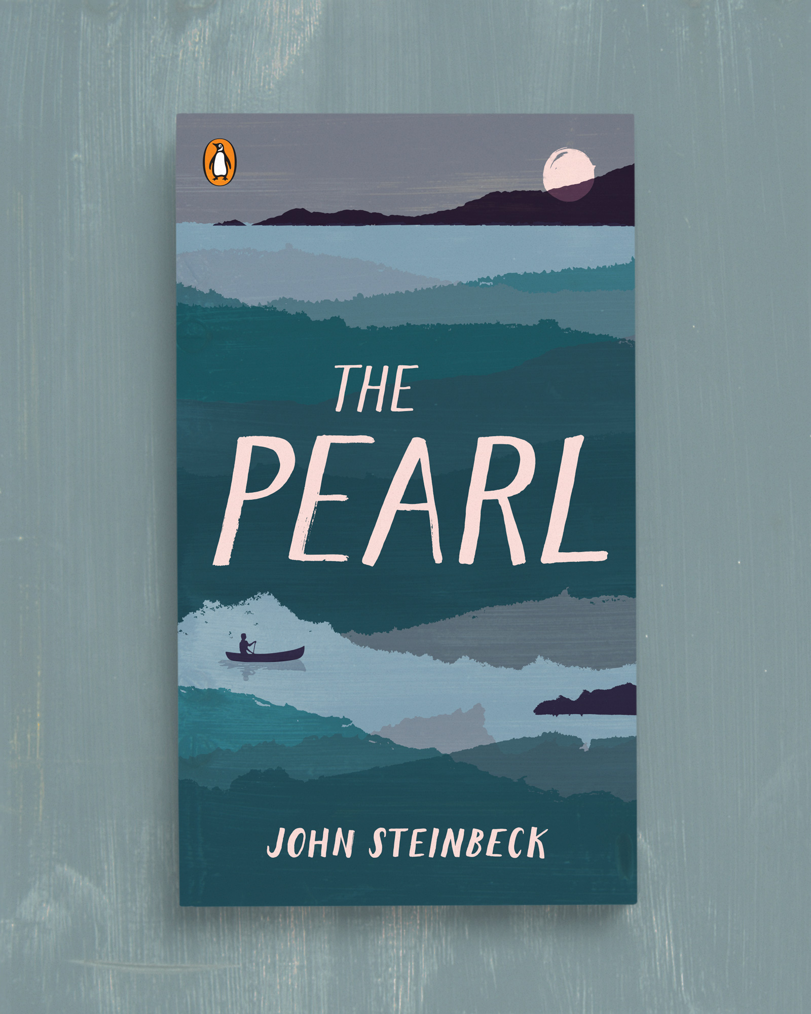
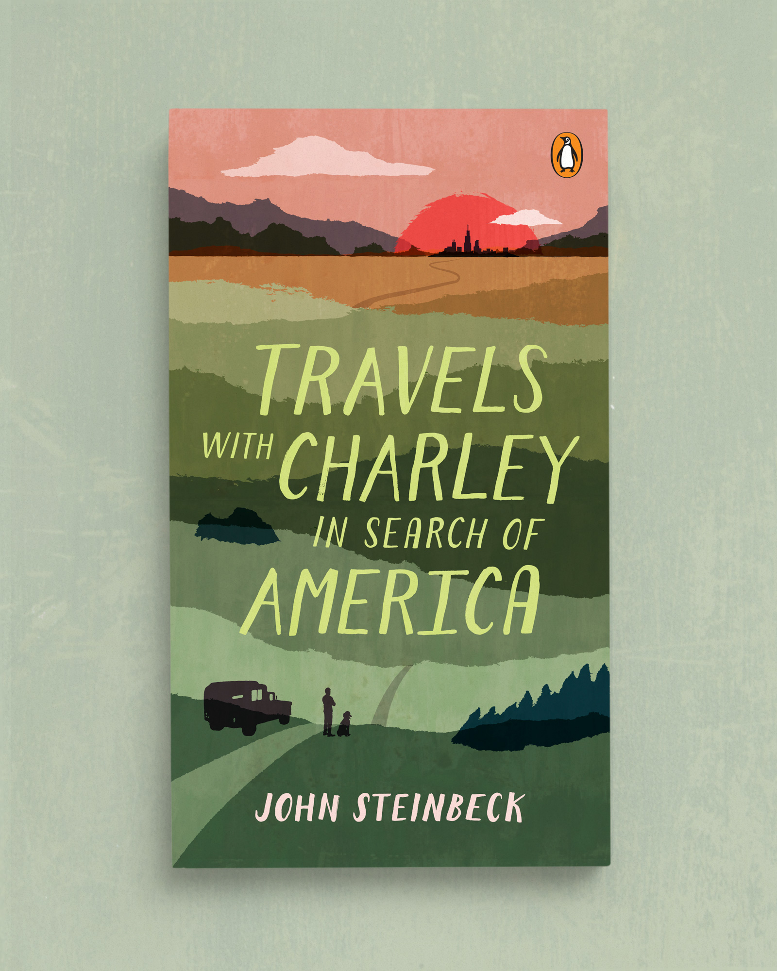
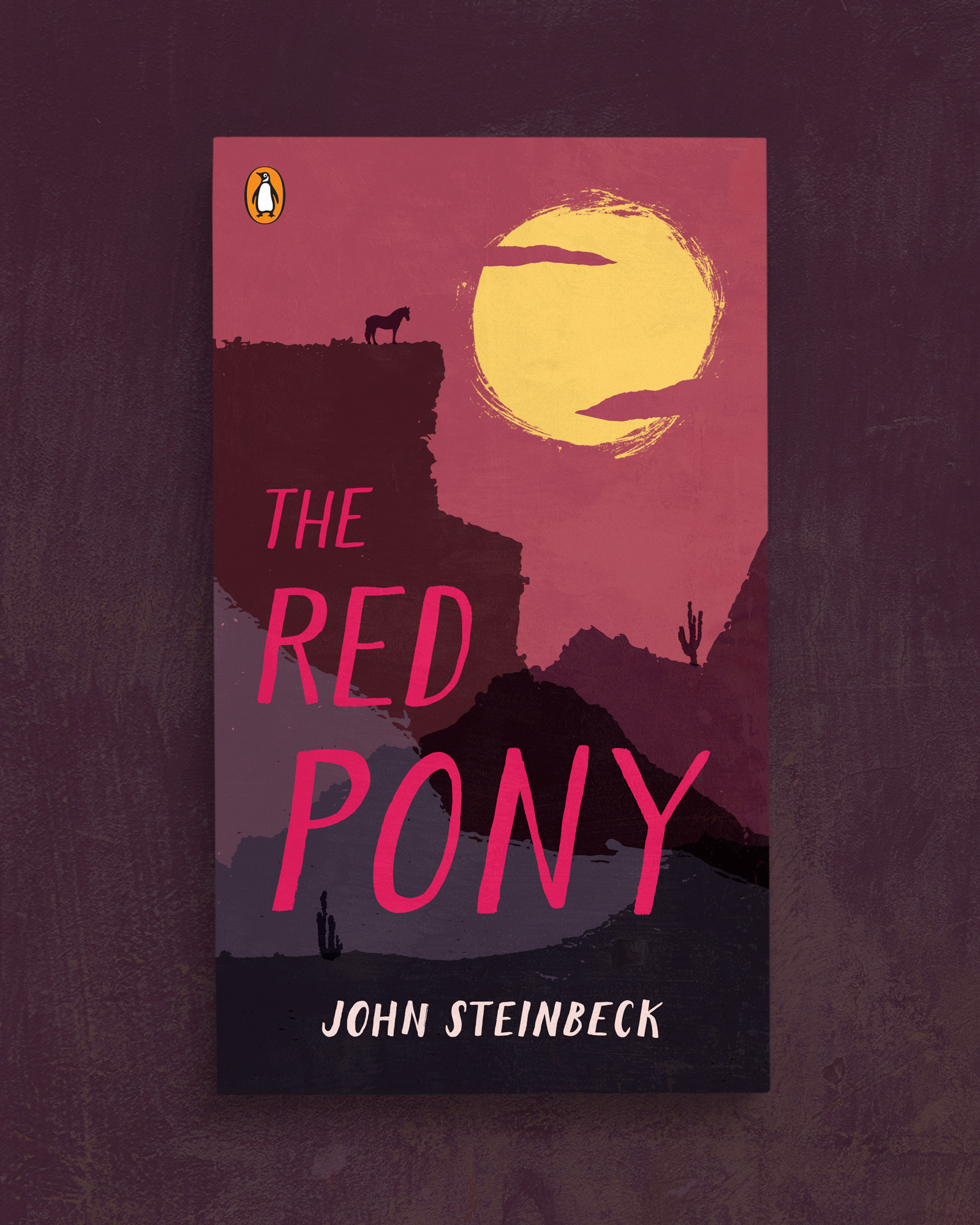
Each landscape in the final direction contains a sun or moon as a narrative counterpoint to the small, vulnerable figures. Of Mice and Men’s setting sun and horizon exaggerates the distance the two characters must travel in search of work and home. The moon of The Pearl bears witness and is also gem-like. The day fades, revealing the journey to come in Travels with Charlie. The horse has reached the end of the line under the sweltering sun in The Red Pony.

Results
Penguin Classics and the Steinbeck Estate were enthusiastic with the results. Legendary art director Paul Buckley guided us through the various directions, ultimately choosing the landscape based illustrations with large, confrontational typography. His main recommendation was to beef up the focus on the rough-hewn lettering, further adding drama and more connection to the classic cover.


